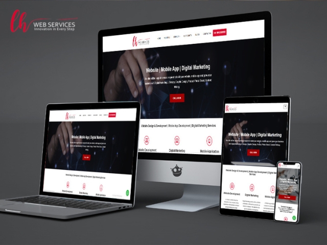
Responsive web design means building a website in a manner which helps the website visitors to have a seamless experience while viewing and interacting with the website on devise of all screen sizes. The website built using responsive web design should be capable of opening on Large screen desktop computers, laptops of all screen sizes, tablet devices and smart phones.
The websites developed using responsive web design these days work better on mobile phones rather than desktop and laptop computers as they offer functionality for the user to send an email with one press of the email icon or call the company directly from within the website with one press of the finger on the phone number. WhatsApp chat integration in responsive websites gives website visitors a quick an easy way to interact with companies via instant chat.
The use of HTML5 and CSS3 for the coding of a website enables developers to make responsive websites that function consistently across devices of all screen sizes, responsive websites don’t look exactly the same on all screen sizes rather such websites adapt the functionality according to the device screen size to give users a highly interactive experience while using the website. HTML & CSS have been used by website developers for many years now and have proven to be very robust and dependable.
WordPress has inbuilt responsive web design functionality and all WordPress website development is responsive by default, this helps developers in rapid development of WordPress website.
At LH Webservices all website development for our clients is done in responsive web design.